
HELLO Salesforce Thinkers, with the help of our previous blogs we learned what are list views and how to create list views in Salesforce Lightning. In this blog we are going to learn about “List view Charts” and how To “Create list view chart In Lightning Experience“.

What are List View Charts?
List view charts are exactly the same as Reports with charts. When we create Reports with charts In Salesforce, first we need to create Report and then with the help of report data we generate the chart. Similarly we can generate List view chart with the help of list data.
List views are ways of displaying small size of data that are instantly accessible for different objects. List views helps us specially when we need lists based on certain criteria.
In Salesforce Lightning we can add charts and render data in multiple chart formats.
List view charts help us to visualize our list view data.
There are three types of charts:
- Vertical bar Chart
- Horizontal bar Chart
- Donuts Chart
For any list view chart, we can change the data display to another type, according to our requirements.
When we create a list view chart for an object, such as Accounts or Opportunities, the chart is associated with the object.
Note:
- The chart is available for any list view that we have permission to see for that object, Except the Recently Viewed list.
- List view charts can only create in Lightning.
- Permission Required : Read on the type of record included in the list AND Create and Customize List Views.
How To Create a List View Chart in Lightning Experience?
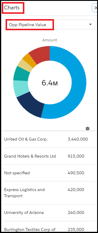
Let’s take an example John wants to see which accounts represent the most overall pipeline value, so he’s going to add a chart to the All Opportunities list view.
Create and edit charts:-
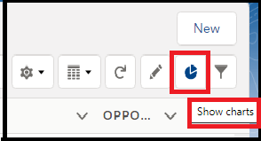
Step 1: From the Sales app, click the Opportunities tab, and select the “All Opportunities” list view.

Step 2: Click the Show Charts icon.
Step 3. In the Charts panel that appears, click the Settings icon and select New Chart.

Step 4. Enter a chart name as “Opp Pipeline Value” and give the following criteria.
- Chart Type: Donuts Chart
- Aggregate Type: Sum
- Aggregate Field: Amount
- Grouping Field: Account Name

Aggregate Type : Specifies how the field data is calculated:
- Sum
- Average
- Count .
Aggregate Field: Specifies the type of data to calculate.
Grouping Field: Labels the chart segments.
Step 5. Click Save.
Now John can easily see which accounts represent the most overall pipeline value with the help of the List view Chart.
Hope the blog is helpful for you.
